
Building an exchange rate chart in Python is a fundamental step for modern financial dashboards and web applications. Today, users need interactive tools to view specific values, zoom into volatility levels, and compare multiple pairs in real time. Static images simply won't do. Web developers require interactive tools that enable their users to quickly identify specific values they wish to view or zoom into volatility areas to compare multiple pairs at the same time.
In this tutorial, we will move away from traditional desktop GUIs and explore developing interactive, browser-rendered financial visualizations with Plotly. This approach ensures your data tools are web-ready and production quality.
Prerequisites And Setup
To follow along with this tutorial, you will require a Python environment and some key libraries. Open your terminal and type:
pip install plotly requests pandas dash
| Tool | Purpose |
|---|---|
| Python 3.x | Core programming language |
| Requests | Handling API calls to CurrencyFreaks |
| Pandas | Data manipulation and structuring |
| Plotly | Generating interactive web-based charts |
| Dash | (Optional) Building a live web dashboard |
You will also need a CurrencyFreaks API Key.
Sign Up Here, and you will receive your free key from the dashboard!
Environment Setup (API Key Security)
For maximum protection of your API key, store it as an environment variable instead of hardcoding it directly in your terminal.
Mac/Linux
export CURRENCYFREAKS_API_KEY="your_api_key_here"
Windows (PowerShell)
setx CURRENCYFREAKS_API_KEY "your_api_key_here"
Step 1: Fetching Real-Time Rates (Free Tier)
To ensure our API connection is functioning properly, we first verify it using CurrencyFreaks' latest rates endpoint. Their free tier provides this vital initial checkpoint of API setup.
import requests
import os
api_key = os.getenv('CURRENCYFREAKS_API_KEY')

if not api_key:
    raise ValueError("API key not found. Please set CURRENCYFREAKS_API_KEY environment variable.")


url = f"https://api.currencyfreaks.com/v2.0/rates/latest?apikey={api_key}"

response = requests.get(url)
response.raise_for_status()
data = response.json()
if "rates" not in data:
    raise ValueError(
        "Invalid API response: 'rates' key missing. "
        "Check your API key and environment variable setup."
    )


# Displaying a snippet of the free tier data
print(f"Base Currency: {data['base']}")
print(f"Sample Rate (EUR): {data['rates']['EUR']}")
Step 2: Understanding The Historical And Time-Series Endpoints (Paid Requirement)
To create an accurate exchange rate chart Python application, it is necessary to access historical time series data as opposed to just snapshots of current exchange rates.
Since the free endpoint only offers current rates, trend analysis cannot be performed over time, and 30/60/90 day charts cannot be created from this source.
CurrencyFreaks' free tier alone does not offer enough data visualization capabilities to enable its full potential; thus offering two different forms of historical information for your convenience:
1. Historical Rates (Single Date)
This endpoint allows you to retrieve exchange rates for a particular past date, with availability depending on provider tier access. An example use case would be "What was USD - EUR on March 1?"
However, this endpoint alone is ineffective for building charts, as you would need to make multiple API calls (one per date).
2. Time Series Endpoint (Required for Charts)
The time series endpoint allows users to retrieve exchange rates across an arbitrary date range, all at once, using just a single request.
This tutorial's goal is to build a 90-day chart. Our use case: "Give me USD/EUR from Jan 1 through Mar 31".
Note: The time series endpoint requires a Standard plan or above. Without it, Steps 3–6 will return an API error. See CurrencyFreaks Pricing to upgrade before proceeding.
CurrencyFreaks' Time Series Endpoint provides efficient and scalable time series visualization.
Note: Exchange rate chart users require this feature. Professional plans offer this endpoint. Likewise, dashboard builders, analytics tool creators, or financial visualization designers will find this tool essential.
Step 3: Fetching 90 Days Of Historical Data
The time series endpoint provides exchange rate data in the form of daily records that include both dates and exchange rates for every entry in its list.
Below is an example that extracts USD to EUR data over the past 90 days and transforms it into a Pandas DataFrame for easy visualization.
import requests
import pandas as pd
from datetime import datetime, timedelta
import os
api_key = os.getenv('CURRENCYFREAKS_API_KEY')
if not api_key:
    raise ValueError("API key not found. Please set CURRENCYFREAKS_API_KEY environment variable.")

end_date = datetime.now().strftime('%Y-%m-%d')
start_date = (datetime.now() - timedelta(days=90)).strftime('%Y-%m-%d')

url = (
   f"https://api.currencyfreaks.com/v2.0/timeseries"
   f"?apikey={api_key}&startDate={start_date}&endDate={end_date}"
   f"&base=USD&symbols=EUR"
)

response = requests.get(url)
response.raise_for_status()
data = response.json()
if "historicalRatesList" not in data:
    raise ValueError(
        "Invalid API response: 'historicalRatesList' missing. "
        "Check API key, subscription plan, or endpoint access."
    )


records = []

# Correct parsing based on actual API response (list of objects)
for entry in data.get("historicalRatesList", []):
   date = entry.get("date")
   rate = entry.get("rates", {}).get("EUR")

   if date and rate:
       records.append({
           "Date": date,
           "Rate": float(rate)
       })

df = pd.DataFrame(records)

# Convert to datetime and sort
df["Date"] = pd.to_datetime(df["Date"])
df = df.sort_values("Date")

print(df.head())
Step 4: Building The Interactive Chart With Plotly
To build an interactive chart using plotly.express, ensure your df variable contains historical exchange rate data as shown in Step 3. Once this code has run, it will open a new tab in your browser with an interactive line chart, eliminating desktop window management requirements altogether.
import requests
import pandas as pd
from datetime import datetime, timedelta
import plotly.express as px
import os
api_key = os.getenv('CURRENCYFREAKS_API_KEY')
if not api_key:
raise ValueError("API key not found. Please set CURRENCYFREAKS_API_KEY environment variable.")
# Define date range (last 90 days)
end_date = datetime.now().strftime('%Y-%m-%d')
start_date = (datetime.now() - timedelta(days=90)).strftime('%Y-%m-%d')
# Fetch historical data
url = (
f"https://api.currencyfreaks.com/v2.0/timeseries"
f"?apikey={api_key}&startDate={start_date}&endDate={end_date}"
f"&base=USD&symbols=EUR"
)
response = requests.get(url)
response.raise_for_status()
data = response.json()
if "historicalRatesList" not in data:
raise ValueError(
"Invalid API response: 'historicalRatesList' missing. "
"Check API key, subscription plan, or endpoint access."
)
records = []
for entry in data.get("historicalRatesList", []):
date = entry.get("date")
rate = entry.get("rates", {}).get("EUR")
if date and rate:
records.append({
"Date": date,
"Rate": float(rate)
})
# Create DataFrame
df = pd.DataFrame(records)
df["Date"] = pd.to_datetime(df["Date"])
df = df.sort_values("Date")
# Handle empty dataset safely
if df.empty:
raise ValueError("No historical data returned. Please check your API key or plan access.")
# Build interactive chart
fig = px.line(
df,
x='Date',
y='Rate',
title='USD to EUR Exchange Rate (Last 90 Days)',
labels={'Rate': 'Exchange Rate (EUR)', 'Date': 'Date'},
template='plotly_white'
)
fig.update_traces(mode="lines+markers", hovertemplate="Date: %{x}<br>Rate: %{y}")
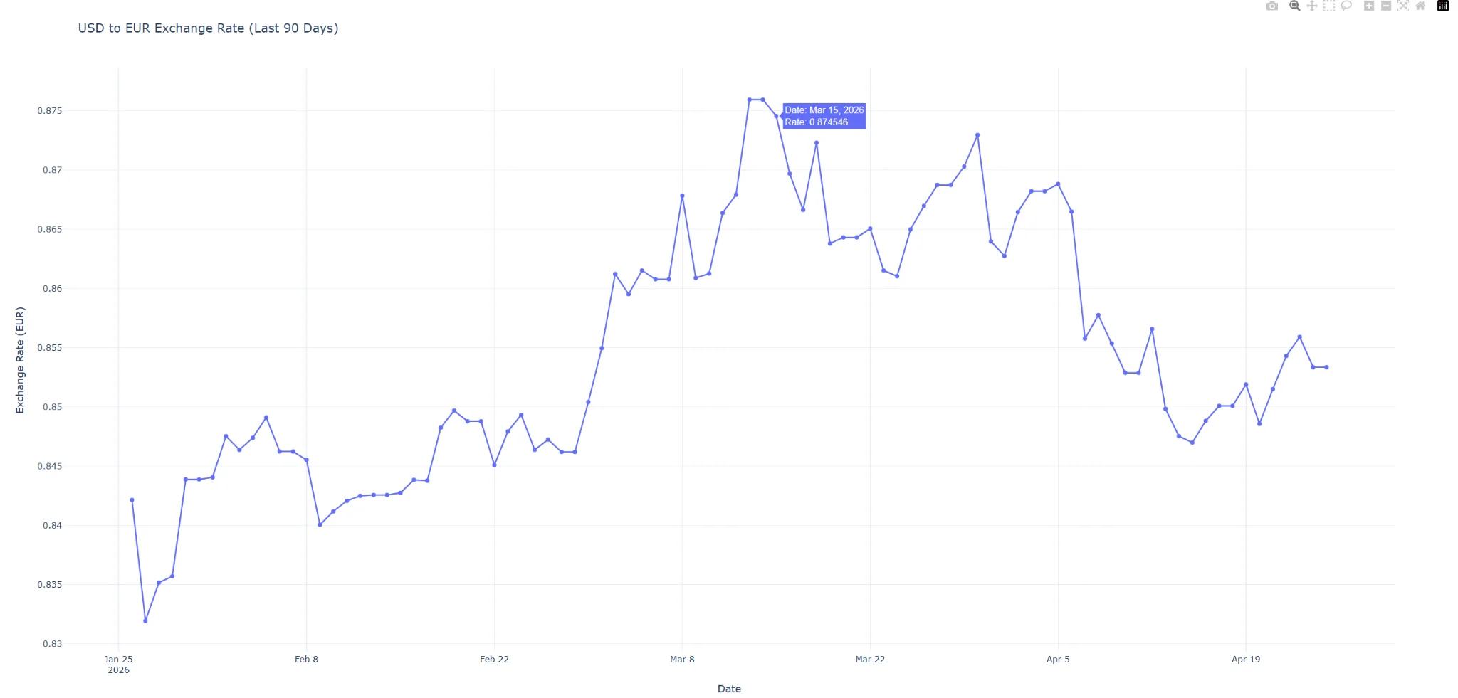
fig.show()
This will produce an interactive chart in your browser. Furthermore, you can hover over data points to inspect exact exchange rate values.
Rendered Chart Preview
Here is an interactive exchange rate chart produced using the code above, featuring hover-over functionality to display exact values as well as inspect trends over time.
Step 5: Multi-Currency Comparison Chart
To create an effective Python exchange rate visualization, often multiple currencies must be compared against a base currency. To this end, we fetch multiple symbols (EUR and GBP) before reformatting them for Plotly compatibility.
import requests
import pandas as pd
from datetime import datetime, timedelta
import os
api_key = os.getenv('CURRENCYFREAKS_API_KEY')

if not api_key:
    raise ValueError("API key not found. Please set CURRENCYFREAKS_API_KEY environment variable.")

end_date = datetime.now().strftime('%Y-%m-%d')
start_date = (datetime.now() - timedelta(days=90)).strftime('%Y-%m-%d')

url = (
   f"https://api.currencyfreaks.com/v2.0/timeseries"
   f"?apikey={api_key}&startDate={start_date}&endDate={end_date}"
   f"&base=USD&symbols=EUR,GBP"
)

response = requests.get(url)
response.raise_for_status()
data = response.json()
if "historicalRatesList" not in data:
    raise ValueError(
        "Invalid API response: 'historicalRatesList' missing. "
        "Check API key, subscription plan, or endpoint access."
    )


records = []

# Parse multiple currencies into long-format structure
for entry in data.get("historicalRatesList", []):
   date = entry.get("date")
   rates = entry.get("rates", {})

   for currency in ["EUR", "GBP"]:
       rate = rates.get(currency)
       if date and rate:
           records.append({
               "Date": date,
               "Currency": currency,
               "Rate": float(rate)
           })

df_multi = pd.DataFrame(records)

df_multi["Date"] = pd.to_datetime(df_multi["Date"])
df_multi = df_multi.sort_values("Date")
if df_multi.empty:
    raise ValueError("No data returned for selected currencies. Check API access or date range.")


# Plot multi-line chart
import plotly.express as px

fig = px.line(
   df_multi,
   x='Date',
   y='Rate',
   color='Currency',
   title='USD vs EUR & GBP Exchange Rate Comparison',
   labels={'Rate': 'Exchange Rate', 'Date': 'Date'}
)

fig.update_traces(mode="lines", hovertemplate="Date: %{x}<br>Rate: %{y}")
fig.show()
Step 6: Building A Live Dashboard With Dash (Optional)
To take this one step further, Dash makes your chart into an interactive live dashboard, enabling users to select a currency and dynamically update the visualization.
from dash import Dash, dcc, html, Input, Output
import plotly.express as px
import requests
import pandas as pd
from datetime import datetime, timedelta
import os

api_key = os.getenv('CURRENCYFREAKS_API_KEY')

if not api_key:
    raise ValueError("API key not found. Please set CURRENCYFREAKS_API_KEY environment variable.")

app = Dash(__name__)

app.layout = html.Div([
   html.H1("Currency Analytics Dashboard"),

   dcc.Dropdown(
       id='currency-dropdown',
       options=[
           {'label': 'EUR', 'value': 'EUR'},
           {'label': 'GBP', 'value': 'GBP'},
           {'label': 'JPY', 'value': 'JPY'}
       ],
       value='EUR'
   ),

   dcc.Graph(id='exchange-graph')
])

@app.callback(
   Output('exchange-graph', 'figure'),
   Input('currency-dropdown', 'value')
)
def update_graph(selected_currency):

    end_date = datetime.now().strftime('%Y-%m-%d')
    start_date = (datetime.now() - timedelta(days=90)).strftime('%Y-%m-%d')

    url = (
        f"https://api.currencyfreaks.com/v2.0/timeseries"
        f"?apikey={api_key}&startDate={start_date}&endDate={end_date}"
        f"&base=USD&symbols={selected_currency}"
    )

    response = requests.get(url)
    response.raise_for_status()
    data = response.json()

    if "historicalRatesList" not in data:
        raise ValueError(
            "Invalid API response: 'historicalRatesList' missing. "
            "Check API key, subscription plan, or endpoint access."
        )

  records = []

    for entry in data.get("historicalRatesList", []):
        date = entry.get("date")
        rate = entry.get("rates", {}).get(selected_currency)

        if date and rate:
            records.append({
                "Date": date,
                "Rate": float(rate)
            })

    df = pd.DataFrame(records)
    df["Date"] = pd.to_datetime(df["Date"])
    df = df.sort_values("Date")

    fig = px.line(
        df,
        x='Date',
        y='Rate',
        title=f"USD to {selected_currency} Exchange Rate (Last 90 Days)"
    )

    return fig


if __name__ == '__main__':
   app.run_server(debug=True)
Why Plotly And Not Matplotlib?
Your choice of library for creating an exchange rate chart in Python determines whether its output will be a static image or a production-ready web tool.
Matplotlib produces static PNG or SVG images; Plotly charts, however, are designed to be interactive from the outset. Users can interact with data points by hovering their mouse over data points to see exact values, zoom into volatile periods for further examination, or pan across dates without writing additional code.
Built for the Browser
Plotly is powered by Plotly.js, so every chart renders natively in your browser without the need for desktop windows, a GUI dependency, or additional configuration for web deployment.
Instant Feedback Loop
A single call to fig.show() opens a chart immediately in a browser tab, providing a fast iteration cycle -- adjust a parameter, rerun your script, and view its updated visualization within seconds!
Scales into Full Dashboards
Matplotlib does not directly correspond with Dash; however, with Plotly, the same chart code used for standalone visualization can later be directly imported into an interactive Dash dashboard application -- creating fully interactive dashboards featuring dropdowns, filters, and live updates without writing JavaScript!
Financial Data Visualization Strategies Are Better When Conducted Through an Interactive Dashboard
Plotly's interactive tooling makes exploration much simpler for this use case than static charts, which makes Plotly the superior option in this regard.
Conclusion
Visualizing Currency data effectively requires moving beyond static charts and desktop-only libraries. By using Python, Plotly, and CurrencyFreaks historical API, you can build tools that provide deep insights into market trends with an enjoyable web user experience - this combination ensures both high performance and user-friendliness for your app.
FAQs
What Is The Best Library For Currency Data Visualization In Python?
Plotly is considered the go-to library for interactive web-based financial charts, as it renders directly in the browser while offering support for Dash application development.
Can I Visualize Historical Rates For Free?
CurrencyFreaks free tier provides real-time rates; to create historical charts with trends over time, you typically require accessing the time series endpoint, which typically requires Professional plan access.
Is Plotly Dash Hard To Learn?
For those familiar with Python, Dash should be quite straightforward to learn—its intuitive nature eliminates any need for extensive JavaScript knowledge while providing powerful web-based interactivity tools.
Sign Up for free at CurrencyFreaks today and start visualizing your financial data with precision.