
Currencies move in packs, not in isolation, and raw numbers don’t show that very well. A forex heatmap turns all that motion into something you can grasp at a glance. You see what’s strong, what’s weak, and what’s going on, without staring at spreadsheets.
When you see the whole market at once, patterns jump out with just a glance. This is why traders rely on visual tools instead of isolated prices. It’s more like checking the weather than trying to make sense of a messy spreadsheet.
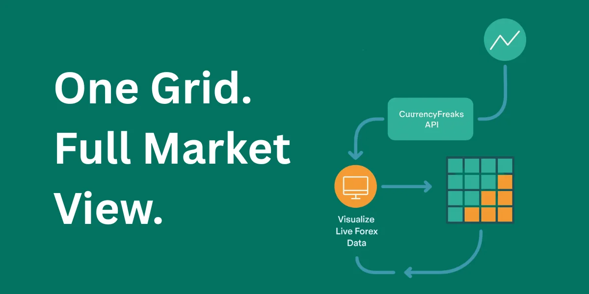
In this guide, you will build a forex heatmap using CurrencyFreaks for data and D3.js for visuals. The goal is clarity, not decoration. By the end, you will know how to turn live currency data into a clean and useful view for the forex market.
What are Forex Heatmaps And How They Work
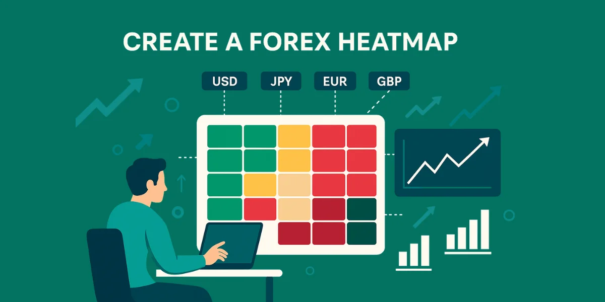
A Forex heatmap shows how currencies perform against each other over a specific period. Each cell compares a base and a quote from multiple currency pairs and uses different colors to reflect movement. This helps explain complex foreign exchange trading relationships visually.
Relative performance matters more than raw price movement. A currency can rise yet still trail others in the same session. A heatmap highlights the strongest and weakest currencies instantly using contrast.
The grid layout pulls everything into one place. Rows and columns show how things connect, and the colors make the direction clear. It works the same whether you’re watching quick moves or bigger, slower shifts.
Why Use A Forex Heatmap For Currency Analysis
Speed matters when markets move fast. A heatmap lets forex traders spot changes right away instead of flipping through charts. That quick view really helps when forex currency volatility picks up.
Patterns stand out when pairs align or diverge. You can spot correlation, imbalance, or strength without switching screens. For most forex traders, it helps confirm direction faster.
Common reasons traders rely on this view include:
-
Identifying the dominant and weakest currencies
-
Confirming trend direction before a trade
-
Reducing noise from single price moves
-
Comparing many assets inside one heat map
Tools And Technologies Used In This Forex Heatmap
CurrencyFreaks delivers reliable FX rates with a clear structure. It supports live and historical access across global markets. That reliability matters when accuracy drives decisions.
D3.js transforms raw numbers into visual meaning. It handles scales, grids, and motion efficiently. This makes it ideal for building a responsive currency heat map.
All you need is JavaScript, HTML, and CSS. No heavy setup or extra frameworks. The result is a lightweight visualization driven by clean data.
Why Choose CurrencyFreaks to Create a Forex Heatmap?
Data quality defines every visual outcome. CurrencyFreaks delivers consistent coverage across major currencies without gaps. That stability matters when traders invest money under pressure.
The API supports flexible base selection and frequent refresh intervals. This allows fine-tuned updates aligned with investment objectives. It also keeps your view relevant under shifting conditions.
Clear documentation reduces setup friction. Less guessing means faster execution. That balance supports real-world dashboards.
Understanding Forex Data From CurrencyFreaks
CurrencyFreaks covers global currencies across regions and economies. You can compare USD, EUR, JPY, CHF, CAD, and others in one unified response. This helps you read currency strength bar by bar and spot moments where it may make sense to sell or stay out.
You get a live view of how prices are moving. Historical endpoints show longer context. Both work together to reveal strong currencies over time.
Choosing the right endpoint depends on the purpose. Short-term trading favors speed. Strategic views favor stability.
How To Fetch Forex Data Using CurrencyFreaks API
Every request starts with an API key. It controls access and keeps things running without interruptions.
Responses arrive as structured JSON. Each object links a symbol to its rate in a clear way. This format simplifies parsing across many forex currency pairs.
Batch requests improve performance by pulling data for each currency pair in one go. Instead of making repeated calls, you fetch everything at once. This keeps things moving without slowing you down.
Preparing Forex Data For Heatmap Visualization
Raw prices only tell part of the story. The percentage change shows how things really move in forex for today. It makes comparing performance across currencies much easier.
You typically select a reference currency. All others measure against it. This reveals real time data shifts clearly.
Normalization matters for balance. Extremes get compressed while subtle moves remain visible. This creates a cleaner read.
Designing The Forex Heatmap Layout
Layout defines readability before color appears. Rows and columns should follow logical ordering. This anchors the interpretation.
Spacing must feel balanced. Too tight overwhelms. Too loose wastes room. The goal is a usable market heatmap today view.
Labels need to work on every screen size. Responsive scaling keeps text easy to read on phones, tablets, and desktops. Clear labels really help when you’re scanning forex graphs fast.
Mapping Currency Strength To Color Scales
Diverging scales work best. Positive values are marked green, while negative values are marked red. This mirrors how traders read markets.
Neutral zones require restraint. Loud tones near zero distort the meaning. Proper scaling reflects price action accurately.
Missing data stays muted. Gray tones prevent misinterpretation of gaps.
Building The Forex Heatmap With D3.js
D3 begins with an SVG container. This defines the grid area. Each rectangle represents a relationship.
Each cell connects straight to the data, so changes between currencies show up right away. This supports fast re-rendering.
Transitions stay subtle. Motion helps track updates without distraction.
Adding Interactivity To The Forex Heatmap
Hover reveals precise values. Users see changes tied to the prior bar's close or the prior bar's low instantly.
Click actions isolate focus. Highlighting rows helps compare performance against weaker ones.
Animations remain gentle. Excess motion hides insight.
Updating The Forex Heatmap With Live Data
Refresh timing matters. Polling too fast wastes resources. Polling too slow loses relevance.
API limits define cadence. Respecting them ensures stability under current market conditions.
D3 updates elements in place. Only changed values redraw.
Optimizing Performance For Large Currency Sets
Large grids strain browsers. Reducing DOM updates helps immediately.
Efficient joins update only changed cells. D3 handles this well for dense currency market chart views.
Caching avoids repeated calls. Reused data improves speed.
Styling And Customizing The Forex Heat map
CSS controls layout and theme. Consistent visuals build trust.
Dark mode fits trading setups. Light mode suits reports. Both support the best forex markets to trade workflows.
Brand accents stay subtle. Data must lead.
Here is the complete code example:
<!DOCTYPE html>
<html lang="en">
<head>
    <meta charset="UTF-8">
    <title>Forex Heatmap: CurrencyFreaks & D3.js</title>
    <script src="https://d3js.org/d3.v7.min.js"></script>
    <style>
        body { font-family: 'Inter', sans-serif; background: #121212; color: #e0e0e0; margin: 20px; }
        .card { background: #1e1e1e; padding: 25px; border-radius: 12px; box-shadow: 0 4px 20px rgba(0,0,0,0.5); max-width: 900px; margin: auto; }
        header { text-align: center; margin-bottom: 20px; }
        .controls { display: flex; justify-content: center; gap: 10px; margin-bottom: 25px; }
        select, button { padding: 10px; border-radius: 5px; border: 1px solid #333; background: #252525; color: white; }
        button { background: #388e3c; cursor: pointer; border: none; font-weight: bold; }
        #heatmap { display: flex; justify-content: center; }
        .report-box { margin-top: 25px; padding: 15px; background: #252525; border-left: 4px solid #388e3c; border-radius: 4px; }
        .tooltip { position: absolute; background: rgba(0,0,0,0.9); padding: 8px; border-radius: 4px; font-size: 12px; pointer-events: none; opacity: 0; border: 1px solid #444; }
        rect:hover { stroke: #fff; stroke-width: 2px; }
    </style>
</head>
<body>

<div class="card">
    <header>
        <h1>Forex Market Heatmap</h1>
        <p>Live Currency Strength Analysis</p>
    </header>

    <div class="controls">
        <select id="baseCurrency"></select>
        <button onclick="updateHeatmap()">Refresh Heatmap</button>
    </div>

    <div id="heatmap"></div>
    <div id="tooltip" class="tooltip"></div>

    <div class="report-box" id="report">
        <strong>Market Insights:</strong>
        <p id="reportContent">Select a base currency to analyze relative strength.</p>
    </div>
</div>

<script>
    const API_KEY = 'add-your-api-key-here'; // Replace with your actual key
    const symbols = ["USD", "EUR", "GBP", "JPY", "CAD", "AUD", "CHF", "CNY"];

    // 1. Find API & Fetch Symbols (Step 1 & 3 of your workflow)
    async function init() {
        const res = await fetch('https://api.currencyfreaks.com/v2.0/currency-symbols');
        const data = await res.json();
        const select = document.getElementById('baseCurrency');

        symbols.forEach(s => {
            const opt = document.createElement('option');
            opt.value = s;
            opt.textContent = `${s} - ${data.currencySymbols[s] || ''}`;
            select.appendChild(opt);
        });
        updateHeatmap();
    }

    // 2. Data Parsing & Logic (Step 2 & 5 of your workflow)
    async function updateHeatmap() {
        const base = document.getElementById('baseCurrency').value;
        const reportContent = document.getElementById('reportContent');
        reportContent.innerText = "Fetching latest market data...";

        try {
            const res = await fetch(`https://api.currencyfreaks.com/v2.0/rates/latest?apikey=${API_KEY}`);
            const data = await res.json();
            const rawRates = data.rates;

            // Calculate Relative Strength (Normalization)
            const baseValue = parseFloat(rawRates[base]);
            const heatmapData = symbols.map(s => {
                const targetValue = parseFloat(rawRates[s]);
                // Strength is inverse of the rate relative to base
                const relativeStrength = (baseValue / targetValue);
                return { symbol: s, strength: relativeStrength };
            });

            renderHeatmap(heatmapData, base);
            generateReport(heatmapData, base);
        } catch (e) {
            reportContent.innerText = "Error fetching data. Check API Key.";
        }
    }

    // 3. Building Heatmap with D3.js
    function renderHeatmap(data, base) {
        d3.select("#heatmap").html("");
        const margin = {top: 20, right: 20, bottom: 40, left: 20},
              width = 700 - margin.left - margin.right,
              height = 150 - margin.top - margin.bottom;

        const svg = d3.select("#heatmap")
            .append("svg")
            .attr("width", width + margin.left + margin.right)
            .attr("height", height + margin.top + margin.bottom)
            .append("g")
            .attr("transform", `translate(${margin.left},${margin.top})`);

        const x = d3.scaleBand().range([0, width]).domain(symbols).padding(0.05);

        // Diverging Color Scale: Green (Strong), Red (Weak)
        const colorScale = d3.scaleLinear()
            .domain([d3.min(data, d => d.strength), 1, d3.max(data, d => d.strength)])
            .range(["#e74c3c", "#2c2c2c", "#2ecc71"]);

        svg.selectAll()
            .data(data)
            .enter()
            .append("rect")
            .attr("x", d => x(d.symbol))
            .attr("y", 0)
            .attr("width", x.bandwidth())
            .attr("height", height)
            .style("fill", d => d.symbol === base ? "#444" : colorScale(d.strength))
            .on("mouseover", (event, d) => {
                d3.select("#tooltip").style("opacity", 1)
                  .html(`Pair: ${base}/${d.symbol}<br>Strength: ${d.strength.toFixed(4)}`)
                  .style("left", (event.pageX + 10) + "px")
                  .style("top", (event.pageY - 28) + "px");
            })
            .on("mouseout", () => d3.select("#tooltip").style("opacity", 0));

        svg.selectAll("text")
            .data(data)
            .enter()
            .append("text")
            .attr("x", d => x(d.symbol) + x.bandwidth()/2)
            .attr("y", height/2 + 5)
            .attr("text-anchor", "middle")
            .style("fill", "#fff")
            .style("font-weight", "bold")
            .text(d => d.symbol);
    }

    function generateReport(data, base) {
        const sorted = [...data].sort((a, b) => b.strength - a.strength);
        const strongest = sorted[0].symbol;
        const weakest = sorted[sorted.length - 1].symbol;

        document.getElementById('reportContent').innerHTML =
            `Relative to <b>${base}</b>, the <b>${strongest}</b> is showing the highest market momentum (Green), while <b>${weakest}</b> is underperforming (Red).
            This grid filters out chart noise to show where capital is flowing right now.`;
    }

    init();
</script>
</body>
</html>
Output
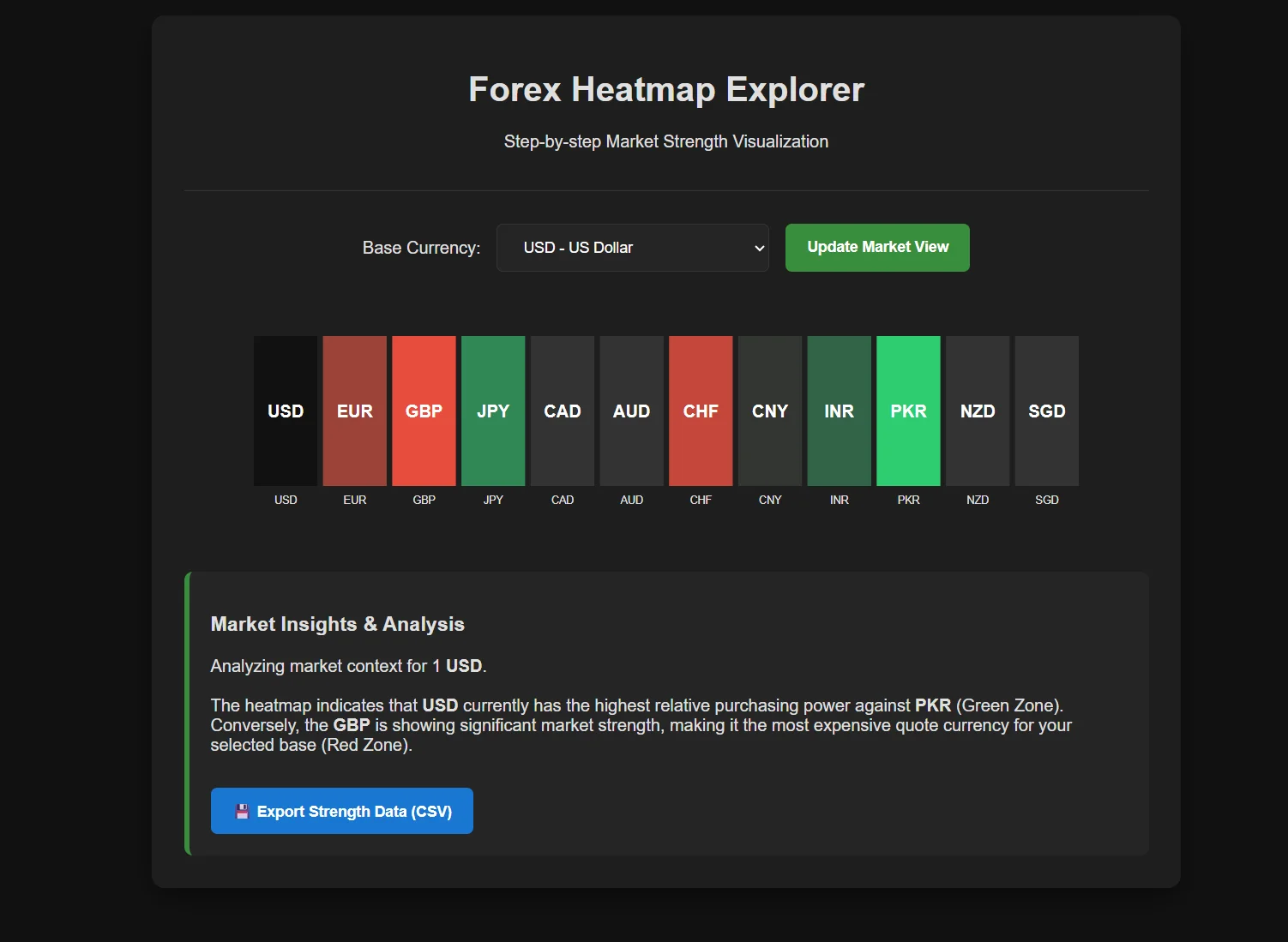
Description: This app executes a systematic pipeline. We fetch exchange rates from CurrencyFreaks. Next, the exchange rates are normalized to our selected base currency. Finally, D3.js transforms the normalized figures into a structured heat map.
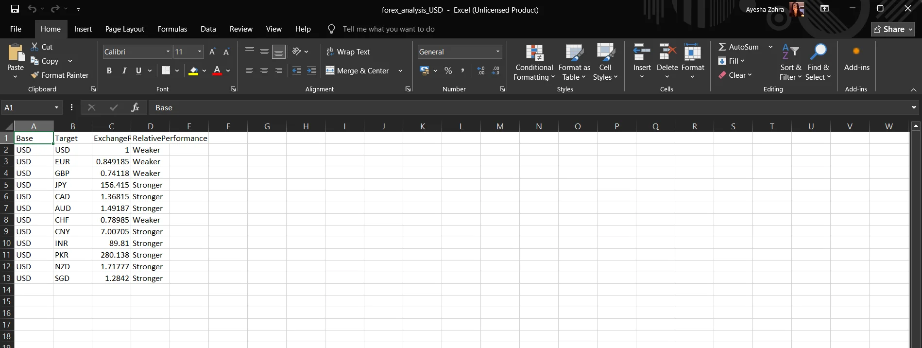
This grid immediately distinguishes between market strength and weakness using color gradients. The application parses these visual relationships into a descriptive text report to provide actionable trading context. Finally, it implements a CSV export function that follows your complete six-step workflow. This tool converts dynamic market data into a permanent, structured record for your analysis.
The Forex Heat Map uses color coding to indicate stronger currencies in green and weaker currencies in red.
Common Mistakes When Building A Forex Heatmap
The following are the common mistakes when building a Forex Heatmap:
-
Getting the base and quote wrong makes the data hard to read. Make sure the direction is clear.
-
Using absolute values hides context. Relative change explains movement better.
-
Accessibility often gets ignored. Poor contrast hurts clarity.
Use Cases For A Forex Heatmap Dashboard
Traders use a heatmap to check direction before entering a trade. It makes it clearer which pair has momentum and is the best forex pair to trade. That clarity makes entries feel calmer and more deliberate.
Analysts use heatmaps to read market mood across regions. Strengths and weaknesses often show up here before news breaks. That early signal helps them stay ahead of shifts.
Educators rely on heatmaps to explain how currencies relate to each other. Visual patterns make complex ideas easier to understand. Students grasp structure faster when they can see it.
Security And Best Practices For API Usage
Never expose API keys in client-side code where anyone can see them. Store API keys safely in environment variables or send requests through a proxy. This keeps them out of sight and out of trouble.
When data doesn’t load, keep everything visible and stable. A small fallback is better than a broken screen. A stable visual builds trust with users.
Logging helps you catch quiet problems early. Small gaps or delays are easier to fix when you notice them right away. This keeps your data flow reliable.
Conclusion
A Forex heatmap blends clean data with thoughtful design. CurrencyFreaks gives you clean data, and D3.js makes the patterns obvious. Together, they create a powerful financial heat map.
Instead of jumping between scattered charts, forex market charts come together in one clear view. You see balance right away. Strengths, weaknesses, and momentum make sense fast, which helps you make better decisions.
From here, you can add alerts, filters, or simple overlays. You might highlight moves around the prior bar's range or flag breaks above the prior bar's high. You can grow it into a full investment heat map or keep it lean as your needs change.
FAQs
What Is A Forex Heatmap Used For?
A heatmap puts relative performance into one clear view. Traders can spot differences between pairs right away. It works like a map currency overview.
How Accurate Is A Forex Heatmap Built With Live Data?
Accuracy depends on feed quality. With reliable sources, updates stay near real time. This supports confident analysis.
Can I Build A Forex Heatmap Without D3.js?
Yes, other tools exist. D3 offers deeper control for complex currency market charts.
Which Timeframe Works Best For A Forex Heatmap?
Short views suit scalping. Longer views support planning. Choose what fits your strategy.
How Many Currency Pairs Should A Forex Heatmap Show?
Fewer pairs improve clarity. Start small and expand carefully for performance.
Start creating a clear Forex heatmap using CurrencyFreaks today.


