
As developers, we know that it is important to get accurate currency information for our applications. Moreover, we are always looking for solutions that are reliable as well as free. At the same time, we also seek efficient data visualization for currency exchange rate data. Therefore, we have written this blog to make things easier for you. We will show you a free online currency converter integration with data visualization charts.
It is important to realize the fact that currency conversion is an important aspect of global businesses. Therefore, having a reliable tool for currency conversion matters a lot. Let's not delay things any further and move forward with our blog post. Let's go.
What Are Currency Conversion Basics?
Currency conversion basics help us understand the exchange rates that determine the value of one currency in terms of another. Exchange rates fluctuate based on various economic factors. As a result, these fluctuations also influence international trade and financial transactions. Factors like interest rates, inflation, and geopolitical events impact these rates.
Let's show you how to create currency exchange rate tools with data visualization for free.
How Do You Implement Currency Exchange API with Data Visualization?
First, visit the CurrencyFreaks website at https://currencyfreaks.com/
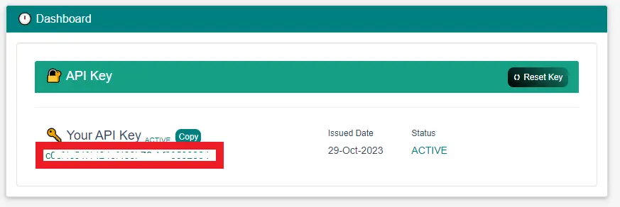
Click on the Sign-Up button written at the top right corner. Next, register an account and navigate to the dashboard to get the API key.
Start Writing the Python Code
Create a Python file in the Visual Studio Code. Then, add the below code to it. Let's break down the code into simple parts for your understanding.
Important Libraries to Import in the Code
import requests
import json
import tkinter as tk
from tkinter import Label, Entry, Button, messagebox, ttk
import matplotlib.pyplot as plt
from matplotlib.backends.backend_tkagg import FigureCanvasTkAgg
from datetime import datetime
Each library serves a specific purpose in the overall functionality of the program.
-
requests are for handling API requests
-
tkinter for the graphical user interface
-
matplotlib for data visualization
-
PIL for handling images.
-
json helps us handle the json format.
-
datetime date handling in the code.
Next, create a variable to add the API key:
api_key = 'ADD YOUR API KEY HERE'
Functions
Then, start writing the functionalities of your application.
def plot_chart():
    start_date = start_date_entry.get()
    end_date = end_date_entry.get()
    base_currency = source_currency_entry.get().upper()
    symbols = target_currency_entry.get().upper()
    chart_type = chart_type_var.get()


    url = f'https://api.currencyfreaks.com/v2.0/timeseries?apikey={api_key}&startDate={start_date}&endDate={end_date}&base={base_currency}&symbols={symbols}'


    try:
        response = requests.get(url)
        if response.status_code == 200:
            data = response.json()
            historical_rates_list = data.get('historicalRatesList')
            if historical_rates_list:
                dates = [entry['date'] for entry in historical_rates_list]
                rates = [float(entry['rates'][symbols]) for entry in historical_rates_list]


                # Convert dates to datetime objects for proper formatting
                dates = [datetime.strptime(date, "%Y-%m-%d") for date in dates]


                # Create the selected chart type
                fig, ax = plt.subplots()


                if chart_type == 'Line Chart':
                    ax.plot(dates, rates, marker='o', label=f'{base_currency}/{symbols}')
                elif chart_type == 'Bar Chart':
                    ax.bar(dates, rates, label=f'{base_currency}/{symbols}')
                elif chart_type == 'Histogram':
                    ax.hist(rates, bins=20, edgecolor='black', label=f'{base_currency}/{symbols}')
                elif chart_type == 'Bubble Chart':
                    sizes = [i * 50 for i in range(len(dates))]  # Basic implementation for bubble sizes
                    ax.scatter(dates, rates, s=sizes, label=f'{base_currency}/{symbols}', alpha=0.7)


                ax.set(xlabel='Date', ylabel=f'Exchange Rate ({base_currency}/{symbols})', title='Historical Exchange Rates')
                ax.legend()


                # Rotate x-axis labels for better readability
                plt.xticks(rotation=45, ha='right')

                canvas = FigureCanvasTkAgg(fig, master=root)
                canvas_widget = canvas.get_tk_widget()
                canvas_widget.grid(row=7, column=0, columnspan=2)

                canvas.draw()


            else:
                messagebox.showinfo("Information", "No historical data found for the selected currencies and date range.")
        else:
            messagebox.showerror("Error", f'Failed to retrieve data. Status code: {response.status_code}')


    except requests.exceptions.RequestException as e:
        messagebox.showerror("Error", f'An error occurred: {e}')
The above function plots the chart for users based on the given currencies. It is interesting to note that we have implemented four different types of forex charts. These are:
-
Line chart
-
Bubble chart
-
Histogram
-
Bar Chart
Graphical User Interface
Finally, we design the graphical user interface of our code as under:
# GUI setup
root = tk.Tk()
root.title("Forex Charts")


title_label = Label(root, text="Forex Currency Charts", font=("Helvetica", 16, "bold"))
title_label.grid(row=0, column=0, columnspan=2, pady=10)


source_currency_label = Label(root, text="Source Currency Code:")
source_currency_label.grid(row=1, column=0, padx=10, pady=5, sticky="e")


source_currency_entry = Entry(root)
source_currency_entry.grid(row=1, column=1, padx=10, pady=5, sticky="w")


target_currency_label = Label(root, text="Target Currency Code:")
target_currency_label.grid(row=2, column=0, padx=10, pady=5, sticky="e")


target_currency_entry = Entry(root)
target_currency_entry.grid(row=2, column=1, padx=10, pady=5, sticky="w")


chart_type_label = Label(root, text="Chart Type:")
chart_type_label.grid(row=3, column=0, padx=10, pady=5, sticky="e")


chart_types = ['Line Chart', 'Bar Chart', 'Histogram', 'Bubble Chart']
chart_type_var = tk.StringVar(root)
chart_type_var.set(chart_types[0])  # Default chart type


chart_type_menu = ttk.Combobox(root, textvariable=chart_type_var, values=chart_types)
chart_type_menu.grid(row=3, column=1, padx=10, pady=5, sticky="w")


chart_button = Button(root, text="Plot Chart", command=plot_chart)
chart_button.grid(row=4, column=0, columnspan=2, pady=10)


start_date_label = Label(root, text="Start Date (YYYY-MM-DD):")
start_date_label.grid(row=5, column=0, padx=10, pady=5, sticky="e")


start_date_entry = Entry(root)
start_date_entry.grid(row=5, column=1, padx=10, pady=5, sticky="w")


end_date_label = Label(root, text="End Date (YYYY-MM-DD):")
end_date_label.grid(row=6, column=0, padx=10, pady=5, sticky="e")


end_date_entry = Entry(root)
end_date_entry.grid(row=6, column=1, padx=10, pady=5, sticky="w")


root.mainloop()
Final Code
import requests
import json
import tkinter as tk
from tkinter import Label, Entry, Button, messagebox, ttk
import matplotlib.pyplot as plt
from matplotlib.backends.backend_tkagg import FigureCanvasTkAgg
from datetime import datetime


# Replace 'YOUR_APIKEY' with the provided API key
api_key = 'b2836e1cbfb54a45b305488bcb04a531'


def plot_chart():
    start_date = start_date_entry.get()
    end_date = end_date_entry.get()
    base_currency = source_currency_entry.get().upper()
    symbols = target_currency_entry.get().upper()
    chart_type = chart_type_var.get()


    url = f'https://api.currencyfreaks.com/v2.0/timeseries?apikey={api_key}&startDate={start_date}&endDate={end_date}&base={base_currency}&symbols={symbols}'


    try:
        response = requests.get(url)
        if response.status_code == 200:
            data = response.json()
            historical_rates_list = data.get('historicalRatesList')
            if historical_rates_list:
                dates = [entry['date'] for entry in historical_rates_list]
                rates = [float(entry['rates'][symbols]) for entry in historical_rates_list]


                # Convert dates to datetime objects for proper formatting
                dates = [datetime.strptime(date, "%Y-%m-%d") for date in dates]


                # Create the selected chart type
                fig, ax = plt.subplots()


                if chart_type == 'Line Chart':
                    ax.plot(dates, rates, marker='o', label=f'{base_currency}/{symbols}')
                elif chart_type == 'Bar Chart':
                    ax.bar(dates, rates, label=f'{base_currency}/{symbols}')
                elif chart_type == 'Histogram':
                    ax.hist(rates, bins=20, edgecolor='black', label=f'{base_currency}/{symbols}')
                elif chart_type == 'Bubble Chart':
                    sizes = [i * 50 for i in range(len(dates))]  # Basic implementation for bubble sizes
                    ax.scatter(dates, rates, s=sizes, label=f'{base_currency}/{symbols}', alpha=0.7)


                ax.set(xlabel='Date', ylabel=f'Exchange Rate ({base_currency}/{symbols})', title='Historical Exchange Rates')
                ax.legend()


                # Rotate x-axis labels for better readability
                plt.xticks(rotation=45, ha='right')

                canvas = FigureCanvasTkAgg(fig, master=root)
                canvas_widget = canvas.get_tk_widget()
                canvas_widget.grid(row=7, column=0, columnspan=2)

                canvas.draw()


            else:
                messagebox.showinfo("Information", "No historical data found for the selected currencies and date range.")
        else:
            messagebox.showerror("Error", f'Failed to retrieve data. Status code: {response.status_code}')


    except requests.exceptions.RequestException as e:
        messagebox.showerror("Error", f'An error occurred: {e}')


# GUI setup
root = tk.Tk()
root.title("Forex Charts")


title_label = Label(root, text="Forex Currency Charts", font=("Helvetica", 16, "bold"))
title_label.grid(row=0, column=0, columnspan=2, pady=10)


source_currency_label = Label(root, text="Source Currency Code:")
source_currency_label.grid(row=1, column=0, padx=10, pady=5, sticky="e")


source_currency_entry = Entry(root)
source_currency_entry.grid(row=1, column=1, padx=10, pady=5, sticky="w")


target_currency_label = Label(root, text="Target Currency Code:")
target_currency_label.grid(row=2, column=0, padx=10, pady=5, sticky="e")


target_currency_entry = Entry(root)
target_currency_entry.grid(row=2, column=1, padx=10, pady=5, sticky="w")


chart_type_label = Label(root, text="Chart Type:")
chart_type_label.grid(row=3, column=0, padx=10, pady=5, sticky="e")


chart_types = ['Line Chart', 'Bar Chart', 'Histogram', 'Bubble Chart']
chart_type_var = tk.StringVar(root)
chart_type_var.set(chart_types[0])  # Default chart type


chart_type_menu = ttk.Combobox(root, textvariable=chart_type_var, values=chart_types)
chart_type_menu.grid(row=3, column=1, padx=10, pady=5, sticky="w")


chart_button = Button(root, text="Plot Chart", command=plot_chart)
chart_button.grid(row=4, column=0, columnspan=2, pady=10)


start_date_label = Label(root, text="Start Date (YYYY-MM-DD):")
start_date_label.grid(row=5, column=0, padx=10, pady=5, sticky="e")


start_date_entry = Entry(root)
start_date_entry.grid(row=5, column=1, padx=10, pady=5, sticky="w")


end_date_label = Label(root, text="End Date (YYYY-MM-DD):")
end_date_label.grid(row=6, column=0, padx=10, pady=5, sticky="e")


end_date_entry = Entry(root)
end_date_entry.grid(row=6, column=1, padx=10, pady=5, sticky="w")


root.mainloop()
Output
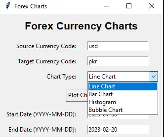
Run the code in Visual Studio Code and it will open the following window.
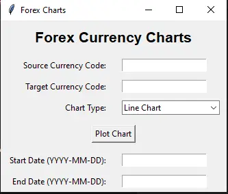
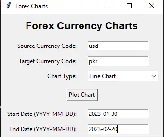
Fill in the required entries and choose your chart type.
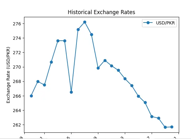
Line Chart
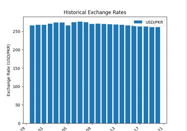
Bar Chart
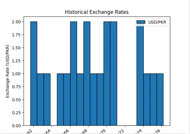
Histogram
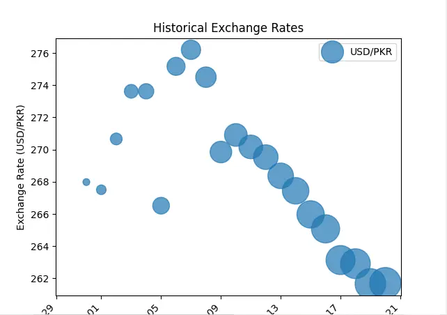
Bubble Chart
Conclusion
In the business world, having accurate currency info is a must for apps. This blog guides developers to a free online currency converter with cool data charts. Knowing the basics of currency conversion, like rates changing based on the economy, is key for global businesses. The blog shows how to use a Python app with CurrencyFreaks API. It lets users visualize historical exchange rates using Line, Bar, Histogram, and Bubble charts.
FAQs
Why Do We Need Data Visualization for Currency Converter?
Data visualization enhances understanding, revealing currency trends and aiding informed decision-making in currency conversion.
What is the Best Currency Exchange Rates API?
CurrencyFreaks is one of the best currency exchange rates APIs.
Can We Use CurrencyFreaks with Data Visualization Tools?
Yes. We have shown the data visualization of currency rates using CurrencyFreaks and Python in the above blog.
What is the Free Currency Exchange API?
You can also try CurrencyFreaks exchange rates API for free.
Sign Up for free at CurrencyFreaks today and visualize accurate data using our API.


